-
This ‘Food Price Increase’ Infographic Explains Why Your Shopping Costs So Much More This Year
20 Apr 2017 by Sloane Hunter in Food, Lifestyle, Money, South Africa, Vibe

Compared to twelve months ago, food prices are considerably higher, and it doesn’t look like the inflation cycle is going to turn any time soon.
The price of a food basket, broken down into nine food categories, rose as a whole. Only three categories, namely bread and cereals, oils and fats, and vegetables, comprising 32% of the food basket, reporting monthly declines.
Over to Fin24 to flesh that out with some hardcore economics talk:
Food price inflation, although moderating to 8.7% year-on-year in March from 10% year-on-year in February, was still the biggest driver of the annual consumer price inflation (CPI).
CPI eased to 6.1% in March 2017 – slightly lower from 6.3% in February 2017, Statistics SA announced on Wednesday.
Meat prices, which comprise 35.5% of the food basket, rose 9.9% y-o-y in March, after recording considerable increases in the previous four months. This increase still reflects the reduced supply following the drought experienced in 2015 and 2016.
The 1.7%-price increases in alcoholic beverages and tobacco in March reflected the annual increases in customs and excise duties, as announced in the National Budget delivered in February 2017.
If those numbers have done your head in then here’s the infographic, showing the percentage increase from last year to now:

Deep hey? And you wonder why your pockets are looking emptier a whole lot quicker.
[source:fin24]
Latest News
-
Pay Your Dues: The Strange History Of Taxes
[imagesource:rawpixel] In this world, nothing can be said to be certain except death an...
-
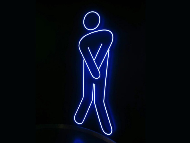
China’s Futuristic Public Toilets Analyses Urine To Measure Your Health
[imagesource:rawpixel] For only R52 a pee, you can now have your urine analysed for any...
-
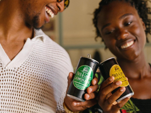
Bartenders Share The Home Bar Ingredients To Pay More Attention To
[imagesource:fitch&leedes] Are you even an adult if you don't have a home bar? And ...
-
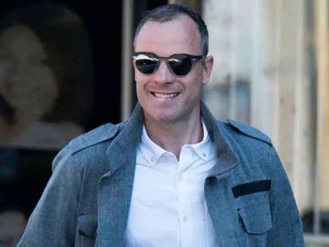
Social Media Is Not Taking Kindly To Oscar Pistorius’s First Public Appearance
[imagesource:sarayatennis/x] Oscar might be out of prison, but he's not off social medi...
-

Armed Robbers Make Off With Nearly Half A Million After Attacking Man At Kenilworth Centre [Video]
[imagesource:gencraftai] Armed robbers managed to run off with nearly half a million ra...
-
-
-
2oceansvibe Partners
-


-