-
BMW’s New Logo Fail
05 Mar 2020 by Carrie in Cars, Design, Lifestyle

Every now and then it’s good to mix it up, make some changes, and put a fresh coat of paint on things.
That said, if you’re a major car manufacturer with a long history and a dedicated client base, you might want to tread carefully before touching people on their studio.
Head on over to the BMW Facebook page, and you’ll find endless love for the brand, from Otto, who stopped in to say “love BMW”, to Mike, who really just wanted to let them know that he loves his “2019 X6M with 570 hp and 554 ft-lbs of torque”.
Considering that both these people own BMWs, they were probably on Facebook while driving.
As a colleague put it – it’s the 99% that give the other 1% a bad name.
Moving on to why you’re here. BMW has changed its logo, and according to The Verge, it wasn’t a great idea.
They call it “everything that’s wrong with modern logo design”:
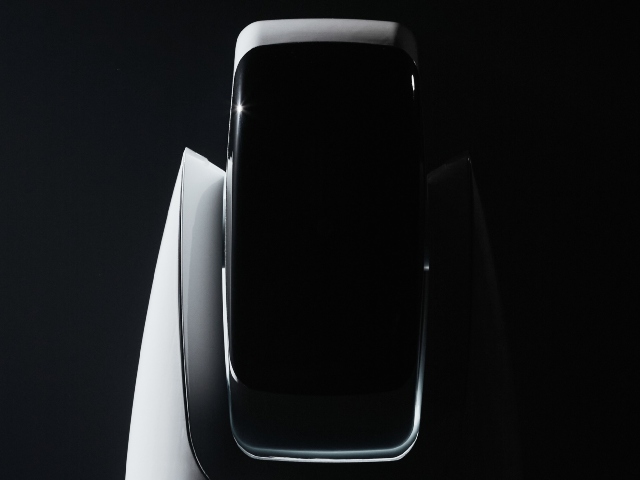
BMW has a new logo, marking the biggest change to the company’s branding since the iconic emblem was introduced in 1917. As with many modern redesigns of logos made to chase today’s trendy aesthetic of a super flat ultra-minimalist style, the new BMW logo sacrifices the company’s well-known identity in favor of presumed modernity.

There are two major changes to the updated logo. The first is largely positive: BMW is reverting back to a flatter design that ditches the very dated 3D effects and shading that were introduced in 1997 with a design that resembles the simpler logo the company has been using since 1963.
The second change is the removal of the black outer ring in favour of a transparent background, which if we’re honest, looks a bit kak.
The effect is less “clarity” and more like someone on the creative team got sloppy and accidentally deleted the background on the Photoshop file before they exported it.

There’s a reason why we don’t see many transparent backgrounds with white text on them from most companies: a lot of our screens and signs still have plain white backgrounds because that makes it easy to read things. Remove the black ring from the logo, and we’re left with a far less distinctive shape that doesn’t read as “BMW” in the way that the black / white / blue emblem has for years.
Furthermore, the transparent effect makes it harder to parse the logo as a whole from a distance: where you once might have registered the outer ring with the “BMW” lettering and the blue-and-white inner disc as a single unit, making the outside ring transparent means that the company is forced to rely on just that single inner element to stand out.
Not everyone is upset. Rama on Facebook wanted to make it very clear that it’s a “SUPER LOGO-SUPER CHOICE-SUPER CARS”.
The image above is an artist’s rendering.
The company hasn’t made it clear when the new logo will be appearing on the hood of your next sedan.
Judging by the social media push on the logo, it will probably be on BMWs soon.
[source:verge]
Latest News
-

Mystery Middle Eastern Billionaire Is Selling The World’s Most Expensive Home For R8,7 Billion
[imagesource:x/@LeDesk_ma] A castle outside Paris once owned by a member of the Rothsch...
-

Now For The Dark Comedy TV Series That Scored 100% On Rotten Tomatoes [Trailer]
[imagesource:netflix] If you’re looking for something to watch on Netflix, then defin...
-
The New AI Paintball-Blasting Home Security Camera Is Quite Happy To Choose Violence [Video]
[imagesource:paintcam/facebook] Taking 'enter at your own risk' to a whole new level, a...
-

Why SA’s Middle Class Is Losing Their Wealth
[imagesource:insauga] If you consider yourself a middle-class South African, then you p...
-

Banker Drowns In ‘Baptism-Style Exorcism’ To Rid Him Of Demon Called ‘Dirty Dan’
[imagesource:flickr] A successful US banker was drowned in a pond during an alledged �...
-
-
-
2oceansvibe Partners
-


-